
t-SNE vs PCA: When a 2D Map Helps and When It Misleads
You run PCA on your data and get one picture. You run t-SNE on the same data and get a completely different one. One shows two messy blobs. The other shows…

Key topics
You run PCA on your data and get one picture. You run t-SNE on the same data and get a completely different one. One shows two messy blobs. The other shows five crisp, well-separated clusters. Which is correct?
Neither — and that's the point. PCA and t-SNE are not competing versions of the same tool. They answer different questions about your data, and each plot has its own blind spots. The real skill isn't picking the "right" method. It's knowing which question you're actually asking.
Two Plots, Two Different Questions
The beginner mistake is treating both methods as interchangeable ways to "shrink dimensions." You throw the same dataset at each, get different cluster arrangements, and assume one of them is broken.
Here's the reframe: PCA asks where does the most variance live? t-SNE asks which points are close neighbors?
Those are fundamentally different questions, and the methods were built to answer them differently. PCA is a linear projection that compresses global structure. t-SNE is a non-linear layout algorithm that arranges points so local similarities are visible. One is a map of the whole territory; the other is a zoomed-in view of who stands next to whom.
The practical rule of thumb: use PCA for a fast, reproducible first look at global structure and as a preprocessing step. Use t-SNE for visual exploration of local groupings when you suspect non-linear structure that a linear projection would miss.
Knowledge check
Check your understanding
Answer this question before you continue.
What PCA Actually Preserves (and Drops)
PCA finds orthogonal directions of maximum variance in your feature space and projects your points onto them. The axes you plot — PC1, PC2 — are real, interpretable directions. They're linear combinations of your original features, and you can inspect the loadings to understand what each axis means.
Because PCA is linear and deterministic, the same data always produces the same plot. Run it twice, get the same result. That reproducibility is a genuine strength, especially when you need to share findings or build a pipeline that others will rerun.
The tradeoff: PCA finds linear directions of variance, whether or not your data's meaningful structure is linear. If your groupings live on a curved or folded shape — imagine a spiral staircase or a rolled-up sheet of paper — PCA will smear them together even when they're genuinely distinct. The projection flattens the fold, and distinct groups end up overlapping on the 2D plane.
PCA also optimizes for variance, not for keeping similar points close. Those sound related, but they're not the same goal. In high dimensions, there's room for many mutually distant points. A linear 2D projection can't keep them all apart. This is the crowding problem: when you compress many dimensions into two, points that were far apart in the original space get squeezed together in the projection.
So when you look at a PCA plot, you're seeing where the global variance lives — not necessarily where the meaningful groups are. Explained variance tells you how much of the total spread your components reconstruct. It doesn't tell you whether that spread matters for your question.
Knowledge check
Check your understanding
Answer this question before you continue.
What t-SNE Actually Preserves (and Distorts)
t-SNE works differently. It converts pairwise similarities between points into probabilities, then optimizes a low-dimensional layout where those probabilities are matched as closely as possible. It's a layout algorithm, not a projection.
That distinction matters. The axes of a t-SNE plot — t-SNE1, t-SNE2 — carry no intrinsic meaning. They're not directions in your feature space. The scale is arbitrary. The cluster sizes are arbitrary. The distances between clusters are arbitrary.
What t-SNE does well is arrange points so that points similar in the high-dimensional space tend to land near each other in the plot. That's why t-SNE is so good at revealing clusters that linear methods miss — it can unfold curved shapes and separate groups that PCA would smear together.
But here's the catch: a 2D canvas cannot faithfully represent all the relationships among points that live in dozens or hundreds of dimensions. t-SNE has to choose what to prioritize. It emphasizes local similarities — who is close to whom — and leaves much of the global spacing underdetermined. The algorithm also deliberately spreads points out to avoid overlap. The result is that clusters often look more separated than they really are. Two clusters that look far apart in a t-SNE plot might be close in the original space — and vice versa.
This is the crowding problem in its practical form: t-SNE sacrifices some global relationships to fit local neighborhoods into two dimensions. The formal label for that constraint is useful to know, but the intuition is what matters — the plot is a local-neighborhood sketch, not a faithful map of all distances.
t-SNE is also stochastic. Different runs can produce visibly different layouts. The cost function isn't convex, so different initializations lead to different results. A single t-SNE plot is not a stable finding. It's one sample from a distribution of possible layouts.
Knowledge check
Check your understanding
Answer this question before you continue.
Perplexity, Learning Rate, and the Knobs That Change the Picture
Here's what makes t-SNE tricky: the output isn't a fixed property of your data. It depends on hyperparameters you must set deliberately.
Perplexity balances local versus global attention. Set it too low, and clusters fragment into noise — you'll see scattered points with no structure. Set it too high, and local structure blurs into a uniform cloud. The typical working range is roughly 5 to 50, but the right value depends on your data. My rule: run several perplexity values and compare the layouts before trusting any single one.
Learning rate controls the optimization. Too high, and points look like a ball with everything roughly equidistant from its neighbors. Too low, and points compress into a dense cloud with few outliers. Scikit-learn's default of 200 works for many datasets, but it's worth checking whether your plot looks pathological.
Changing these knobs changes the story the plot tells. That's not a bug — it's a warning. A t-SNE plot is a function of your choices, not just your data. If a small perplexity change destroys the clusters you thought you found, those clusters weren't robust.
One more practical note: for very high-dimensional data, run PCA first to reduce to roughly 30–50 dimensions, then apply t-SNE. This suppresses noise and speeds up the pairwise-distance computation. It's the standard workflow for a reason.
Knowledge check
Check your understanding
Answer this question before you continue.
PCA vs t-SNE: A Side-by-Side Decision Table
| PCA | t-SNE | |
|---|---|---|
| Objective | Maximize preserved variance | Arrange points to reflect local similarities |
| Linearity | Linear projection | Non-linear layout |
| Determinism | Deterministic — same data, same plot | Stochastic — varies across runs |
| Axes interpretable? | Yes — real directions in feature space | No — layout coordinates only |
| Hyperparameter sensitivity | Low | High (perplexity, learning rate) |
| Scalability | Fast, handles large datasets | Slow, struggles with large datasets |
| Best for | Global structure, preprocessing, feature extraction | Visual exploration of suspected local groupings |
The decision rule depends on your question:
- Use PCA when you need a reproducible, interpretable compression, a variance-oriented first look, or a preprocessing step for another model.
- Use t-SNE only when your goal is visual exploration of suspected local groupings and you accept that the plot is a stochastic, hyperparameter-dependent sketch.
And when should you use neither? If you need features for a downstream model, t-SNE is not a feature-engineering tool. Its layout coordinates carry no meaning, and the stochasticity makes them unreliable as inputs. PCA — or another linear method — is the safer choice for compression that feeds into modeling.
Common Ways a 2D Map Misleads You
Let's walk through the failure modes you'll actually encounter.
Mistake 1: Treating t-SNE cluster separation as proof of real groups. A neat plot is not validation. t-SNE can separate random noise into visually distinct clusters — the algorithm's job is to spread points out, and it does that job well, sometimes too well. A pretty picture never proves meaningful structure.
Mistake 2: Comparing cluster sizes or distances across plots. The scale in a t-SNE plot is arbitrary. A cluster that looks twice as big as another in one run might look half as big in the next. Distances between clusters are not comparable across different runs or different datasets.
Mistake 3: Reading t-SNE axes as features. t-SNE1 and t-SNE2 are layout coordinates. They have no intrinsic meaning. Don't ask "what does t-SNE1 represent?" — it represents nothing.
Mistake 4: Assuming PCA failing to separate groups means the groups don't exist. Linear projection can hide non-linear structure. If your data lives on a curved shape, PCA will flatten it and distinct groups will overlap. That's a limitation of the method, not evidence about your data.
Mistake 5: Trusting a single perplexity setting. The plot is a function of your choices. Run several perplexity values. If the structure persists across settings, that's evidence of stability — not proof that the groups are meaningful. If it appears at one setting and vanishes at another, it was an artifact.
A Practical Workflow for Inspecting High-Dimensional Data
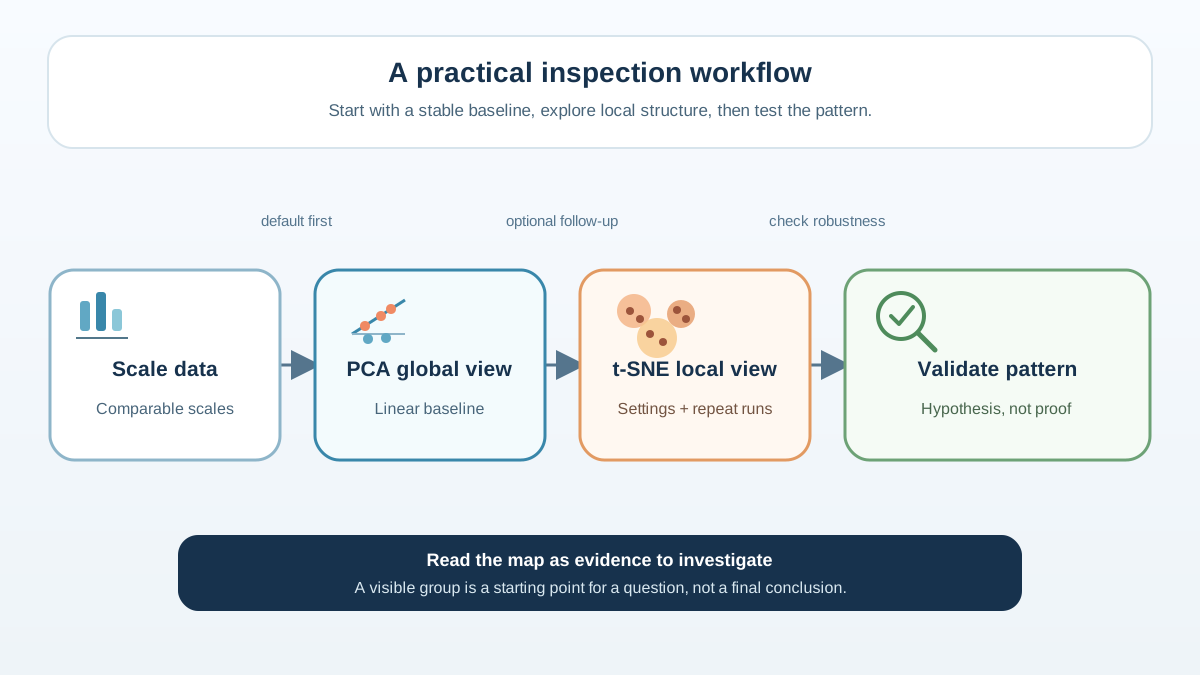
Here's the procedure I use when I want to understand the structure of a high-dimensional dataset:
Step 1: Scale the data, then run PCA. Scaling matters because it defines the geometry both methods see. If your features have different units or scales, the ones with larger values will dominate distance calculations — and therefore dominate both PCA's variance ranking and t-SNE's neighborhood relationships. Make the preprocessing choice explicit, because it changes the picture before any hyperparameter does.
Step 2: Plot the first two or three principal components. Read them as real, interpretable directions. Ask what features load heavily on each axis. This is your auditable global view — but remember that explained variance measures reconstruction of total spread, not whether that spread matters for your question. If your goal is class separation, rare subgroups, or nearest-neighbor structure, a high explained-variance percentage doesn't mean you can stop here.
Step 3: If you suspect non-linear groupings, reduce to ~30–50 PCA components, then run t-SNE. Try several perplexity values — say 5, 15, 30, and 50 — and run each setting more than once. Compare the layouts. Look for neighborhoods that persist across settings and runs.
Step 4: Treat any apparent cluster as a hypothesis. Check it with clustering validation techniques and domain knowledge. Never treat a 2D map as confirmed structure.
The durable rule: PCA gives you an auditable but limited variance-oriented view. t-SNE gives you a suggestive local view that you must not over-trust. Use each for what it's good at.
When you need a reproducible, interpretable compression or a first look at global structure, PCA is your tool. When you're exploring suspected local structure and you accept that the plot is a stochastic, hyperparameter-dependent sketch, t-SNE can reveal patterns that linear methods miss.
But remember the warning at the heart of both methods: a 2D map is a hypothesis generator, not a proof. The next step after any visualization is validation — checking whether the structure you see survives quantitative scrutiny and domain judgment. That's where real confidence comes from.
Knowledge check
Final check
Finish the article by checking the ideas you just learned.
References
Research updated Sep 8, 2026


