
Inspect Regression Residuals With a Scikit-Learn Diagnostic Experiment
A respectable R² can sit on top of a model that is wrong in a structured way. The score summarizes average fit; it says nothing about where the fit fails.…

Key topics
A respectable R² can sit on top of a model that is wrong in a structured way. The score summarizes average fit; it says nothing about where the fit fails. A residual plot is how you ask that question.
This is a short, runnable diagnostic experiment. You will fit a linear model, plot residuals against fitted values, add one second view, name a visible pattern, and choose exactly one follow-up check. The goal is not a prettier plot. The goal is a better next question.
What This Experiment Will and Will Not Prove
A residual plot is evidence about structure, not a verdict on your model. It tells you where to look next. It does not tell you the model is broken, and a clean plot does not tell you the model is correct.
Here is what "done" looks like for this experiment:
- A fitted regression model.
- A residual-versus-fitted scatter plot.
- One additional diagnostic view.
- A named pattern, written in one sentence.
Three assumptions hold the experiment together. First, the model is linear in its parameters. Second, residuals are computed on data the model did not memorize — in-sample residuals can look better than they are, so we will hold some data back. Third, the feature set stays fixed for now; we are diagnosing the fit, not redesigning the pipeline.
If you have already read about residuals as the leftover signal after the model takes its share, this is where that idea becomes a repeatable check.
Set Up a Small, Honest Regression Example
We need a dataset where structure is visible rather than buried in noise. A small synthetic set with one feature and a deliberately curved relationship works well, because you already know the truth and can verify the plot is telling you something real.
import numpy as np
import matplotlib.pyplot as plt
from sklearn.linear_model import LinearRegression
from sklearn.model_selection import train_test_split

rng = np.random.default_rng(0)
X = np.linspace(0, 10, 200).reshape(-1, 1)
y = 2.0 * X.ravel() + 0.4 * X.ravel()**2 + rng.normal(0, 2.0, size=200)

X_train, X_test, y_train, y_test = train_test_split(
    X, y, test_size=0.3, random_state=0
)

model = LinearRegression().fit(X_train, y_train)
y_hat = model.predict(X_test)
residuals = y_test - y_hat

print("coef:", model.coef_, "intercept:", model.intercept_)
print("test R^2:", model.score(X_test, y_test))
Expected output will look roughly like a coefficient near 2 plus a positive intercept, and a test R² that is high but not perfect — the squared term is real, and a straight line cannot capture it. That gap between "high R²" and "wrong shape" is the whole point.
Note: Computing
residuals = y_test - y_hatexplicitly matters. When you hide the subtraction behind a library call, you stop owning the quantity you are plotting, and you stop noticing when the sign convention flips.
Knowledge check
Check your understanding
Answer this question before you continue.
Plot Residuals Against Fitted Values
This is the primary view. Residuals go on the vertical axis; fitted values go on the horizontal.
plt.figure(figsize=(7, 5))
plt.scatter(y_hat, residuals, s=30, alpha=0.7)
plt.axhline(0, color="red", linestyle="--", linewidth=1.2)
plt.xlabel("Fitted values")
plt.ylabel("Residuals")
plt.title("Residuals vs. fitted")
plt.show()
Fitted values are the right x-axis because they expose structure the model failed to capture across its own prediction range. Plotting residuals against the raw target or a single feature can hide the same structure behind the scale of the input.
A healthy residual-versus-fitted plot looks like a shapeless band centered near zero with roughly constant vertical spread. No curve, no funnel, no cluster. The red reference line is the visual anchor: it turns a cloud of points into a readable signal by giving your eye a baseline to compare against.
On this dataset you should see a clear U-shape or arch. The model under-predicts at the low and high ends and over-predicts in the middle. That is the squared term announcing itself.
Common mistake: Plotting residuals against the raw target and concluding "the residuals look fine." The raw target can absorb the curvature and mask it.
Knowledge check
Check your understanding
Answer this question before you continue.
Add a Second View: Spread or Order
One plot shows shape. A second plot makes spread or dependence visible. Pick one and justify it.
If your concern is changing variance, use a scale-location style view: the square root of the absolute residuals against fitted values. The square root compresses large values so a widening funnel becomes easier to see.
plt.figure(figsize=(7, 5))
plt.scatter(y_hat, np.sqrt(np.abs(residuals)), s=30, alpha=0.7)
plt.xlabel("Fitted values")
plt.ylabel("sqrt(|residuals|)")
plt.title("Scale-location")
plt.show()
A flat, even band suggests roughly constant spread. A funnel — narrow on one side, wide on the other — suggests the error spread changes with the prediction level, which affects how much you should trust errors at the extremes.
If your rows carry meaning, such as time order, plot residuals against observation order instead. That view catches dependence the fitted-value plot cannot see. Either way, the second view narrows the hypothesis; it does not confirm it.
Knowledge check
Check your understanding
Answer this question before you continue.
Read the Pattern Without Overclaiming
Turn the plots into a small vocabulary, then apply discipline.
| Pattern | What it suggests | Next check |
|---|---|---|
| Curvature (U, arch, wave) | Missing nonlinear term or interaction | Add a squared or interaction feature, re-plot |
| Funnel (changing spread) | Error variance depends on prediction level | Try a transformation of the target, re-plot |
| A few far-out points | Outliers or high-leverage observations | Inspect those rows before changing the model |
| Flat band | No visible structure in this view | Do not conclude normality — that needs a Q-Q plot |
The discipline is simple: a pattern is a hypothesis about the data or the model. The next step is a test, not a rewrite. A flat residual plot does not confirm normally distributed errors; that is a different question with a different view.
Choose the Next Diagnostic, Not the Next Rewrite
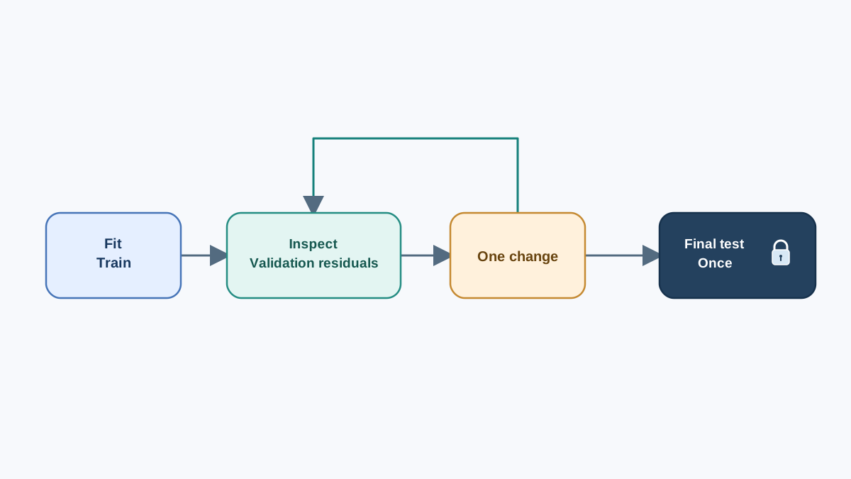
Map each pattern to one follow-up check.
- Curvature: add a squared term and re-plot.
- Funnel: try a log or square-root transform of the target and re-plot.
- Far-out points: inspect those observations directly before touching the model.
Change one thing at a time. If you add a squared term and a transform simultaneously, you cannot attribute the result to either.
Here is the boundary that keeps this honest. The test split you used to inspect the original model is now spent for diagnostic purposes. If you compare a revised model against those same residuals, you are tuning to the diagnostic, and any apparent improvement may not generalize. So the comparison below uses a validation split carved from the training data, and the test set stays untouched until the end.
from sklearn.model_selection import train_test_split
from sklearn.preprocessing import PolynomialFeatures
from sklearn.pipeline import make_pipeline

X_fit, X_val, y_fit, y_val = train_test_split(
    X_train, y_train, test_size=0.3, random_state=1
)

poly_model = make_pipeline(
    PolynomialFeatures(degree=2, include_bias=False),
    LinearRegression(),
).fit(X_fit, y_fit)

val_residuals = y_val - poly_model.predict(X_val)
Re-plot val_residuals against the new fitted values. If the curvature disappears on validation data, you learned something real about the data. If it persists, the problem is likely elsewhere — a different feature, a different functional form, or noise.
Only after you have settled on a revision do you touch the test set once, as a final check:
print("final test R^2:", poly_model.score(X_test, y_test))
Warning: Do not tune the model until the residuals look pretty. A model adjusted to satisfy the diagnostic is overfit to the diagnostic itself, and you will have learned nothing that generalizes.
Knowledge check
Check your understanding
Answer this question before you continue.
Where This Fits in Your Evaluation Workflow
Residual inspection answers questions about structure and spread. It does not replace held-out evaluation, learning curves, or metric choice. Those are separate diagnostics with their own evidence, and they answer different questions.
Skip this experiment when the target is categorical, when the model is not a regression model, or when the real problem is upstream in the data pipeline. A residual plot cannot diagnose a broken join.
The loop is short: fit, plot, name the pattern, run one targeted check — on validation data, not the test set. Run it on your own dataset this week. Write the pattern you see in one sentence before you change anything. Then pick exactly one follow-up check and let the output tell you whether your hypothesis was right.
Knowledge check
Final check
Finish the article by checking the ideas you just learned.
References
Build stronger machine learning foundations
Use structured resources to connect theory, scikit-learn workflows, and evaluation practice.


