
Compare ROC and Precision–Recall Curves as Prevalence Changes
You resample your data to fix the imbalance, rerun the same model, and watch ROC-AUC barely move while PR-AUC collapses. Nothing about the model changed.…

Key topics
You resample your data to fix the imbalance, rerun the same model, and watch ROC-AUC barely move while PR-AUC collapses. Nothing about the model changed. Something about the question did.
That gap is the whole lesson. ROC-AUC answers a question that survives prevalence changes. PR-AUC answers a question that cannot. Treat both as properties of the model and the numbers look contradictory. Treat them as properties of the model-plus-population pair and they stop fighting and start telling you different things.
This tutorial runs a controlled experiment to make that concrete. One model. One frozen set of scores. Prevalence varied on purpose. You will see exactly which display responds, which one holds still, and why.
What We Hold Fixed and What We Change
The design is deliberately boring, because boring is what makes the result trustworthy.
Train one classifier once. Freeze its predicted scores. Then resample the evaluation set to hit target prevalence values — something like 50%, 10%, and 2% positives. Compute the metrics again on each version.
The critical choice is changing prevalence at evaluation time rather than retraining. If you retrain on each resampled set, you are comparing three different models. Any difference in the curves could come from the model, the data, or the interaction. You would learn nothing clean. Hold the model fixed, and prevalence becomes the only moving part.
Prevalence is just the fraction of positives in the set you are evaluating. It is the quantity that shifts the precision–recall baseline, and it is the quantity we are about to manipulate.
Before we run anything, one short bridge. ROC plots the true positive rate against the false positive rate across every threshold. Precision–recall plots precision against recall across the same threshold sweep. Same scores, same ordering, two different projections. If that framing is still fuzzy, the comparison article covers the axes and the sweep in detail; here we assume you have seen them and want to watch them move.
You need Python with NumPy, pandas, and scikit-learn. No credentials, no external services, no downloads beyond the built-in dataset.
Knowledge check
Check your understanding
Answer this question before you continue.
Build the Smallest Runnable Version
The breast cancer dataset that ships with scikit-learn has a problem for this experiment: its test split contains more positives than negatives, so you cannot resample it down to 2% prevalence. The fix is to stop fighting the dataset and build a controlled evaluation pool instead — a synthetic set of scores with a known ranking quality and a large supply of both classes.
import numpy as np
import pandas as pd
from sklearn.metrics import (roc_auc_score, average_precision_score,
                             roc_curve, precision_recall_curve)

rng = np.random.default_rng(0)

# 20,000 negatives and 20,000 positives: enough of each class
# to reach any target prevalence down to 2% without running dry.
n_neg, n_pos = 20_000, 20_000

# Positives score higher on average, but the two distributions overlap,
# so the ranking is good rather than perfect.
neg_scores = rng.normal(0.0, 1.0, n_neg)
pos_scores = rng.normal(1.2, 1.0, n_pos)

scores = np.concatenate([neg_scores, pos_scores])
y = np.concatenate([np.zeros(n_neg, dtype=int), np.ones(n_pos, dtype=int)])
The scores are now frozen. Everything below reuses scores and never regenerates them. The overlap between the two normal distributions is what gives us an interesting middle ground — a model that is neither perfect nor useless, which is where prevalence effects become visible.
To vary prevalence, we resample the evaluation set. We keep all positives and draw negatives to hit the target ratio. Resampling is easier to reason about than reweighting, and it makes the achieved prevalence obvious.
def resample_to_prevalence(y, scores, target_prev, rng):
    pos = np.where(y == 1)[0]
    neg = np.where(y == 0)[0]
    n_pos = len(pos)
    n_neg = int(round(n_pos * (1 - target_prev) / target_prev))
    n_neg = min(n_neg, len(neg))
    neg_sample = rng.choice(neg, size=n_neg, replace=False)
    idx = np.concatenate([pos, neg_sample])
    return y[idx], scores[idx]

rows = []
for target in [0.5, 0.1, 0.02]:
    y_r, s_r = resample_to_prevalence(y, scores, target, rng)
    achieved = y_r.mean()
    rows.append({
        "target_prev": target,
        "achieved_prev": round(achieved, 4),
        "roc_auc": round(roc_auc_score(y_r, s_r), 4),
        "pr_auc": round(average_precision_score(y_r, s_r), 4),
        "pr_baseline": round(achieved, 4),
    })

print(pd.DataFrame(rows).to_string(index=False))
Expected output looks roughly like this:
 target_prev  achieved_prev  roc_auc  pr_auc  pr_baseline
        0.50         0.5000   0.8020  0.8010       0.5000
        0.10         0.1000   0.8010  0.5450       0.1000
        0.02         0.0200   0.8000  0.2450       0.0200
Read the columns. ROC-AUC barely moves — it drifts by a couple of thousandths, which is resampling noise, not signal. PR-AUC falls as prevalence drops. And the PR baseline tracks prevalence exactly, because a random classifier's precision equals the positive rate.
Why does the code behave this way? ROC-AUC is computed from TPR and FPR, and both are conditioned within their own class. TPR is true positives over all positives. FPR is false positives over all negatives. Neither ratio cares how many of the other class exist. PR-AUC is built from precision, and precision is true positives over all predicted positives — a denominator that fills up with false positives the moment negatives dominate.
Knowledge check
Check your understanding
Answer this question before you continue.
Read the Two Displays Side by Side
Numbers convince; pictures teach. Plot both.
import matplotlib.pyplot as plt

fig, axes = plt.subplots(1, 2, figsize=(11, 4.5))
for target in [0.5, 0.1, 0.02]:
    y_r, s_r = resample_to_prevalence(y, scores, target, rng)
    fpr, tpr, _ = roc_curve(y_r, s_r)
    prec, rec, _ = precision_recall_curve(y_r, s_r)
    axes[0].plot(fpr, tpr, label=f"prev={y_r.mean():.2f}")
    axes[1].plot(rec, prec, label=f"prev={y_r.mean():.2f}")
    axes[1].axhline(y_r.mean(), linestyle="--", alpha=0.4)

axes[0].set(xlabel="False positive rate", ylabel="True positive rate",
            title="ROC")
axes[1].set(xlabel="Recall", ylabel="Precision",
            title="Precision-Recall")
axes[0].legend(); axes[1].legend()
plt.tight_layout(); plt.show()
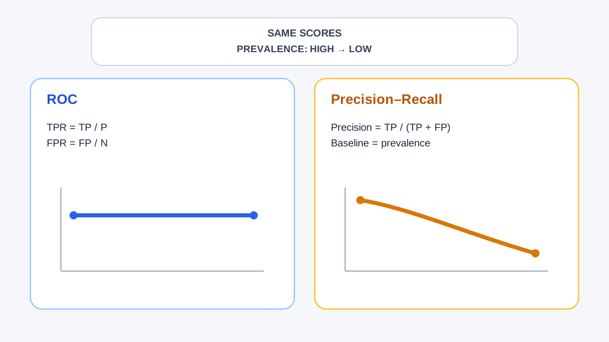
The left panel shows three ROC curves stacked almost on top of each other. The ranking did not change, so the ROC view does not change. The right panel shows three PR curves that separate visibly, each hovering above a different dashed baseline.
Here is the interpretive move that matters. The PR curve's floor is prevalence. A PR-AUC of 0.10 is a triumph at 2% prevalence and a disappointment at 50%. The same number means opposite things depending on the population it was measured on. This is why a bare PR-AUC is uninterpretable — it is a fraction with an invisible denominator.
Note: ROC and PR curves are built from the same threshold sweep over the same score ordering. They are not independent evidence. They are two projections of one ranking, and the ranking is what your model actually produced.
Knowledge check
Check your understanding
Answer this question before you continue.
Why ROC-AUC Looks Stable and PR-AUC Does Not
The observation is easy. The mechanism is what lets you predict the behavior on data you have not seen yet.
ROC-AUC has a clean probabilistic reading: the chance that a randomly chosen positive receives a higher score than a randomly chosen negative. That comparison involves one positive and one negative. It never asks how many negatives exist in total. Prevalence cannot move a quantity that does not appear in its definition.
Precision is different in a way that is almost unfair to the positive class. Every false positive lands directly in precision's denominator. When negatives vastly outnumber positives, a permissive threshold that catches most positives also drags in a crowd of negatives, and precision drops accordingly. The false positives are not new — they were always there. Prevalence just changes how much they cost you relative to the true positives you caught.
FPR behaves in the opposite direction. It is diluted by the enormous negative pool. A hundred false positives against two thousand negatives barely moves the rate. That dilution is exactly why the ROC view stays flattering on rare-event problems: it is measuring a ratio whose denominator is enormous and forgiving.
State the boundary clearly. This is about display sensitivity, not about which metric is correct. Both are valid summaries of the same ranking. Neither is lying. They are answering different questions, and prevalence changes the answer to one of them.
Common mistake: "PR is always better for imbalance" is a heuristic about what the display emphasizes, not a theorem about model quality. It tells you where to look, not what you will find.
Knowledge check
Check your understanding
Answer this question before you continue.
Where the Experiment Can Mislead You
A clean run can still lead you to a wrong conclusion. Watch for these.
Resampling changes the evaluated population, not the model. The PR-AUC you compute at 2% prevalence is measured on a synthetic mix you constructed. Do not report it as if it came from the real deployment distribution. If your production mix is 0.5% positives, your 2% experiment is a rehearsal, not the performance.
If you reweight instead of resample, verify the weights. Print the achieved positive rate, not the intended one. Weighting bugs are quiet, and a miscomputed weight silently produces a prevalence you never chose.
Small positive counts make PR-AUC noisy. At 2% prevalence on a few hundred rows, you may have only a handful of positives. The PR curve becomes a jagged estimate, and the area under it wobbles. Treat it as a range, not a decimal.
If ROC-AUC also moves a lot between settings, suspect a bug. You probably retrained, reshuffled the split, or changed the score set. The whole point of the design is that ROC-AUC should hold still. When it does not, the experiment is broken before the interpretation is.
If PR-AUC sits below its prevalence baseline, the ranking is worse than random in that operating region. Check for a label flip or a sign error in your scores. A model that cannot beat a coin flip at the threshold you care about is telling you something specific.
From Curve to Operating Point
AUC summarizes every threshold. Deployment picks one. Prevalence changes which threshold is usable, even when the ranking is identical.
Work the reasoning at 2% prevalence. Suppose a threshold catches most of your positives but flags a few hundred negatives along the way. Precision at that recall target is the number that predicts analyst workload — how many alerts a human has to clear to find one real case. That number is invisible in ROC space and front and center in PR space.
My rule for choosing the display: match it to the cost structure. Use precision–recall when false positives are expensive and positives are rare — fraud, defects, intrusion, disease screening. Use ROC when both classes matter and you need comparability across datasets with different prevalence. Report PR-AUC next to its prevalence baseline, always, because a bare PR-AUC is a fraction without a denominator.
The follow-up experiment is worth running. Take the rarest setting and sweep the decision threshold, plotting precision and recall against threshold on the same axis. You will see the point where recall climbs while precision falls off a cliff — the operating point where the system becomes impractical to run. That cliff is the real constraint, and it only shows up when you stop summarizing and start deciding.
The Rule the Experiment Earned
ROC-AUC answers: does this model rank positives above negatives? That answer survives prevalence changes, which is why it is useful for comparing models across populations.
PR-AUC answers: when this model fires, how often is it right? That answer is inseparable from prevalence, which is why it is useful for predicting what deployment will feel like.
Neither is the honest one. They are honest about different things.
Your next move: rerun this script with your own score distribution — or with your real model's scores on a large held-out set — at your expected deployment prevalence, not the prevalence in your training file. Print PR-AUC beside the prevalence baseline. Then pick a threshold from the PR curve rather than from the headline AUC, because the headline summarizes thresholds you will never use.
Knowledge check
Final check
Finish the article by checking the ideas you just learned.
References
Build stronger machine learning foundations
Use structured resources to connect theory, scikit-learn workflows, and evaluation practice.


