
Plot and Interpret Learning Curves With Scikit-Learn
You have seen the classic two-line plot. One line starts high and drifts down. The other starts low and climbs. Somewhere on the right, they meet, and the…

Key topics
You have seen the classic two-line plot. One line starts high and drifts down. The other starts low and climbs. Somewhere on the right, they meet, and the article you were reading says "now you know whether you need more data or a better model."
Then you call learning_curve yourself, and the questions arrive all at once. Which scoring metric? Which cv? Why are the shaded bands so wide? And what, exactly, are you supposed to change based on this picture?
This tutorial answers those questions in order. We will generate the curves, read them honestly, and pick one experiment to run next. I assume you already know what training and validation scores are and have seen the high-bias and high-variance shapes. If those ideas are still fuzzy, read the intuition piece on learning curves first, then come back. Here we focus on producing the plot and turning it into a decision.
What the learning_curve Function Actually Returns
Before you run anything, build a precise mental model of the function. It is simpler than it looks, and most confusion comes from expecting it to behave like fit.
learning_curve takes an estimator, the full training set (X, y), and a few configuration arguments. It returns three arrays:
train_sizes: the training-set sizes it actually used, in the same units you passed in.train_scores: shape(n_ticks, n_cv_folds).test_scores: shape(n_ticks, n_cv_folds)— the validation scores.
That shape is the key detail. For every training size, the function runs cross-validation and records one score per fold. You get a grid of scores, not a single line. Averaging across folds is your job.
A few arguments deserve attention:
train_sizes accepts fractions or absolute counts. A float in (0, 1] is treated as a fraction of the maximum training set size. The default is five evenly spaced fractions from 0.1 to 1.0. Absolute integers are interpreted as sample counts.
cv controls the splitting strategy and defaults to 3-fold. For classifiers, scikit-learn uses stratified folds by default. If your data is grouped or time-ordered, you must pass an explicit splitter — a random split will quietly lie to you.
scoring defaults to the estimator's own score method. Set it explicitly to the metric that matches your problem. The default is convenient, not correct.
One behavior surprises almost everyone: the function does not save or return a fitted model. It trains many temporary models, scores them, and discards them. If you expected to reuse the estimator afterward, you cannot. That is by design — the curve is a diagnostic, not a training run.
If you also pass return_times=True, you get fit_times and score_times. That is useful when the curve is slow rather than wrong.
Knowledge check
Check your understanding
Answer this question before you continue.
A Minimal Runnable Example
Let us get to a working plot fast. The example uses only scikit-learn, NumPy, and Matplotlib, plus a small built-in dataset, so it is deterministic and needs no downloads.
import numpy as np
import matplotlib.pyplot as plt
from sklearn.datasets import load_breast_cancer
from sklearn.model_selection import learning_curve
from sklearn.linear_model import LogisticRegression

X, y = load_breast_cancer(return_X_y=True)

estimator = LogisticRegression(max_iter=5000)

train_sizes, train_scores, val_scores = learning_curve(
    estimator,
    X,
    y,
    train_sizes=np.linspace(0.1, 1.0, 8),
    cv=5,
    scoring="accuracy",
    n_jobs=-1,
)

train_mean = train_scores.mean(axis=1)
train_std = train_scores.std(axis=1)
val_mean = val_scores.mean(axis=1)
val_std = val_scores.std(axis=1)

plt.figure(figsize=(8, 5))
plt.plot(train_sizes, train_mean, "o-", label="Training score")
plt.fill_between(train_sizes, train_mean - train_std, train_mean + train_std, alpha=0.2)

plt.plot(train_sizes, val_mean, "s-", label="Validation score")
plt.fill_between(train_sizes, val_mean - val_std, val_mean + val_std, alpha=0.2)

plt.xlabel("Training examples")
plt.ylabel("Accuracy")
plt.title("Learning curve")
plt.legend(loc="best")
plt.grid(True)
plt.show()
Expected output: a two-line plot. The training curve starts high and drifts down as more data is added. The validation curve starts low and rises. The shape is the success criterion here, not any specific number.
Why average across folds? Because a single fold's score is noisy. The mean is your best estimate; the standard deviation is the honest picture of how much that estimate wobbles. Plotting the band as mean ± std shows both.
One detail to internalize: the training score is measured on the same data the model just fit. It is optimistic by construction. A high training score is not evidence of a good model — it is evidence that the model can memorize.
Knowledge check
Check your understanding
Answer this question before you continue.
Reading the Shape Without Overclaiming
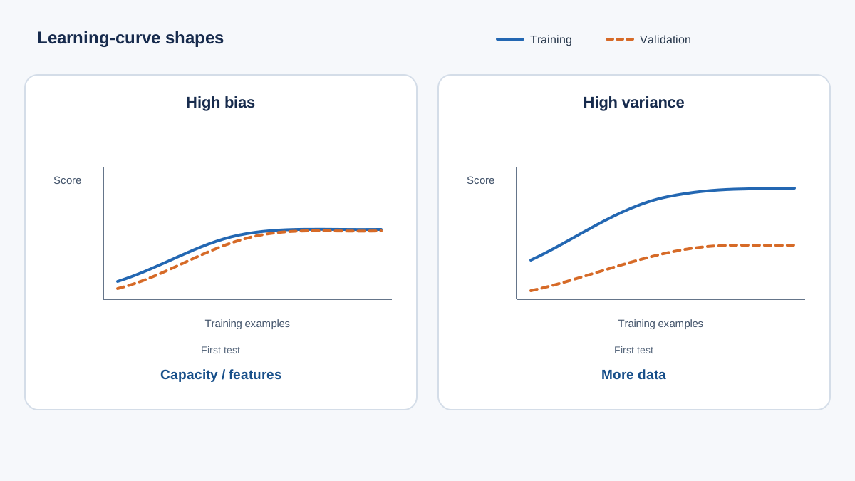
You will see two patterns most of the time.
High bias. Both curves converge to a similar, mediocre score. The validation curve has flattened before the data runs out. Within the range you measured, adding more rows did not improve validation performance.
High variance. A wide, persistent gap between a high training score and a lower validation score. The validation curve is still climbing at the largest training size. More data is likely to help.
Here is the honest reading: these shapes are consistent with a cause, not a diagnosis. A wide gap can come from too much model flexibility, too little data, noisy labels, or a leaky evaluation setup. The curve narrows the hypothesis space; it does not name the culprit.
The band width matters as much as the line. Wide bands mean the estimate itself is unstable. Any conclusion you draw from a small difference between two curves is fragile. Before you interpret a shape, confirm the split is valid for your data — grouped, temporal, or stratified as needed. A broken split produces a beautiful, meaningless curve.
Knowledge check
Check your understanding
Answer this question before you continue.
Three Ways to Get a Misleading Curve
Most wrong conclusions come from one of three setup mistakes. Each has a debugging signal.
Leakage through preprocessing. If you scale, impute, or encode on the full dataset before splitting, information from the validation folds bleeds into training. Validation scores inflate and the curve flattens. The fix is a Pipeline so every transform is fit inside each fold. Signal: validation score suspiciously close to the training score.
Wrong split for the data. Random folds on grouped or time-ordered data let near-duplicate or future information into training. The curve looks healthy; the deployed model is not. Signal: validation score drops when you fix the split.
Metric mismatch. Accuracy on an imbalanced target makes both curves look flat and high while the minority class is ignored. The curve is not wrong — it is answering a different question than the one that matters. Signal: a curve that barely moves across training sizes.
A fourth, quieter problem: too few folds or too few points on the x-axis. Three folds and five sizes produce a jagged line that invites over-reading. More folds and more sizes cost time but buy a stable picture.
Knowledge check
Check your understanding
Answer this question before you continue.
From Curve to One Justified Experiment
Now the payoff. Convert the shape into a single, falsifiable next step.
For the high-bias shape: test added model capacity or a feature change first. A plateau over the sizes you measured is a hypothesis, not a verdict — it says the model stopped improving across the range you plotted, not that more data is useless forever. If both curves sit at a mediocre score and the validation line has gone flat, a richer model or a better feature is the cheapest experiment to run before you collect more rows.
For the high-variance shape: more data, stronger regularization, or a simpler model. If the validation curve is still climbing at the largest size, more data is the cheapest first bet.
Pick one change. Rerun the same curve with the same cv, scoring, and train_sizes. Compare shapes, not single numbers.
A successful experiment narrows the gap or pushes the validation curve past its old plateau. A failed experiment leaves the curve unchanged — and that is itself evidence that your guessed cause was wrong. Keep a short log: curve shape, change made, new shape. That log is the reusable asset that turns curve reading into a habit.
Where Learning Curves Stop Being Useful
Curves are a data-and-complexity diagnostic, not a hyperparameter search. To choose a specific value for a parameter, use a validation curve over that parameter instead.
Curves say nothing about calibration, threshold choice, or the cost of specific error types. They cannot separate label noise from model flexibility — both produce a persistent gap, and only inspecting the data or the residuals can tell them apart. And they assume your evaluation split reflects deployment. If the world shifts after training, a healthy curve is a historical artifact, not a forecast.
Skip the curve entirely when your dataset is so small that each fold is meaningless, or when a single held-out set already answers your question.
What to Do Next
Generate the curve with an explicit cv and scoring. Read the shape and the band width together. Name the most plausible cause. Then change exactly one thing and rerun.
The curve is a hypothesis generator, not a verdict. When it is healthy but your model still fails, move to the neighboring diagnostics: a validation curve to tune a specific parameter, or residual and error analysis to find structure the score is hiding.
Knowledge check
Final check
Finish the article by checking the ideas you just learned.
References
Build stronger machine learning foundations
Use structured resources to connect theory, scikit-learn workflows, and evaluation practice.


