
Inspect Gaussian Mixture Assignments With a Scikit-Learn Experiment
A hard label is a decision. A posterior probability is a confession about how close that decision was.

Key topics
A hard label is a decision. A posterior probability is a confession about how close that decision was.
Fit a Gaussian mixture, call predict, and you get a tidy column of integers. Every point belongs somewhere. The output looks finished. Then you call predict_proba on the same fitted model and discover that a large share of those points sit near 0.5 — the model assigned them, but it was nearly indifferent. The label hid the uncertainty; the probability matrix exposes it.
This tutorial is a controlled probe. We fix a synthetic dataset, fit a Gaussian mixture model with scikit-learn, and then vary one setting at a time — covariance shape, initialization, seed — to see how much the answer moves. The deliverable is a reproducible script and a small comparison table, not a production clustering model. Two questions drive everything: how do posterior probabilities distribute across points, and how sensitive is the fit to the choices we make before we ever call fit?
If mixture components, responsibilities, and covariance shape are new to you, the concept-level treatment of Gaussian mixtures is the right starting point. Here we assume that background and focus on what the outputs actually say.
What This Experiment Is Actually Testing
Before writing code, be explicit about what success looks like and what it cannot look like.
The experiment tests two things:
- Posterior distribution. For each point, what is the maximum posterior probability, and how many points fall below a threshold where the assignment is genuinely ambiguous?
- Sensitivity. When we change
covariance_type,random_state, orn_initwhile holding the data fixed, how much do convergence status, BIC, and the ambiguous fraction move?
The data is synthetic and generated from a known mixture. That is a deliberate advantage: we can compare the fit against structure we already know. Real data gives no such guarantee, and nothing here proves that any grouping is meaningful in a domain sense. BIC will rank candidate models under shared assumptions; it will not certify that the mixture family matches reality. Keep that boundary in view for the whole experiment.
Build a Seeded Dataset With Overlapping, Differently Shaped Groups
Every later comparison is only meaningful if the input is fixed. We generate two groups with different covariance shapes and deliberate overlap, so some points are genuinely ambiguous.
import numpy as np
from sklearn.pipeline import Pipeline
from sklearn.preprocessing import StandardScaler
from sklearn.mixture import GaussianMixture

rng = np.random.RandomState(0)

# Group A: elongated, tilted
cov_a = np.array([[3.0, 2.2], [2.2, 2.0]])
A = rng.multivariate_normal(mean=[0.0, 0.0], cov=cov_a, size=300)

# Group B: roughly circular, shifted to overlap
cov_b = np.array([[0.8, 0.0], [0.0, 0.8]])
B = rng.multivariate_normal(mean=[2.2, 1.6], cov=cov_b, size=300)

X = np.vstack([A, B])
Two design choices matter here. The elongated group means a spherical or diagonal covariance model cannot represent it well, which is exactly the geometry we want to expose later. The overlap means a clean separation plot is not available — and that is the point. A dataset with obvious gaps would make every method look correct and hide the behavior we came to measure.
Plot the raw scatter before fitting anything. Notice that even reading separation from the plot is already an interpretation, not a fact. Your eye is fitting a model too.
For scaling: standardize inside a fitted pipeline so the transform is learned from the data rather than applied by hand. This matters for covariance estimation because the mixture is fitting variances in the transformed space, and a hand-applied transform can leak information or drift between runs.
def make_pipeline(covariance_type, random_state, n_init=1):
    return Pipeline([
        ("scale", StandardScaler()),
        ("gmm", GaussianMixture(
            n_components=2,
            covariance_type=covariance_type,
            random_state=random_state,
            n_init=n_init,
        )),
    ])
Knowledge check
Check your understanding
Answer this question before you continue.
Fit the Baseline Model and Read the Outputs That Matter
Start with the most flexible covariance setting and a single initialization.
pipe = make_pipeline("full", random_state=0, n_init=1)
pipe.fit(X)
gmm = pipe.named_steps["gmm"]

print("converged:", gmm.converged_)
print("n_iter:", gmm.n_iter_)
print("bic:", gmm.bic(pipe.named_steps["scale"].transform(X)))
Read converged_ and n_iter_ first. A fit that did not converge is not a result — it is a signal to change initialization or raise the iteration limit. Everything downstream is suspect until that flag is True.
Now the probability matrix:
proba = pipe.predict_proba(X)          # shape (n_samples, n_components)
print(proba.shape)
print(proba.sum(axis=1)[:5])           # rows should sum to ~1.0
predict_proba returns one row per sample and one column per component. Each row is a posterior distribution over components, and the rows sum to one. That is the soft assignment.
Compare it against the hard label:
hard = pipe.predict(X)
argmax = proba.argmax(axis=1)
print(np.array_equal(hard, argmax))    # True — predict is just argmax
predict is the argmax of predict_proba. It throws away every bit of confidence information. A point at 0.51 and a point at 0.99 receive the same integer.
Make the ambiguous fraction a first-class output, not a footnote:
max_posterior = proba.max(axis=1)
threshold = 0.7
ambiguous = (max_posterior < threshold).mean()
print(f"ambiguous fraction (< {threshold}): {ambiguous:.3f}")
That single number tells you how much of your dataset the model is guessing about. Track it in every run that follows.
Knowledge check
Check your understanding
Answer this question before you continue.
Plot Posterior Probabilities Instead of Hard Labels
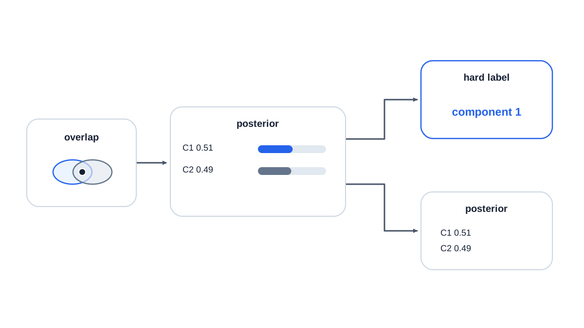
A hard-label scatterplot is a map with the contours erased. Color points by their maximum posterior probability instead, and the uncertain regions appear.
The plot below keeps everything in the standardized space the model was actually fit in. That is the coordinate system where gmm.means_ lives, so the overlaid centers line up with the points. If you want to view the raw coordinates instead, inverse-transform the means with pipe.named_steps["scale"].inverse_transform(gmm.means_) before overlaying them — never mix the two spaces on one plot.
import matplotlib.pyplot as plt

Xs = pipe.named_steps["scale"].transform(X)

fig, axes = plt.subplots(1, 2, figsize=(12, 5))

axes[0].scatter(Xs[:, 0], Xs[:, 1], c=hard, cmap="viridis", s=15)
axes[0].set_title("Hard labels (predict)")

sc = axes[1].scatter(Xs[:, 0], Xs[:, 1], c=max_posterior,
                     cmap="magma", s=15, vmin=0.5, vmax=1.0)
axes[1].set_title("Max posterior (predict_proba)")
fig.colorbar(sc, ax=axes[1])

for ax in axes:
    ax.scatter(gmm.means_[:, 0], gmm.means_[:, 1],
               marker="x", s=120, c="red")
    ax.set_xlabel("scaled feature 1")
    ax.set_ylabel("scaled feature 2")
plt.show()
The left plot looks decisive. The right plot shows a band of pale points where the model is nearly indifferent. Those are the same points that received a confident-looking integer on the left.
Overlay the component means, and where useful the covariance ellipses, to connect the visual to the fitted parameters. Then interpret the ambiguous band honestly: it is where the model is uncertain, which may reflect genuine overlap in the data or a misspecified covariance shape. A confident-looking plot is not validation — a well-separated picture can come from a model that is overfitting the sample.
Knowledge check
Check your understanding
Answer this question before you continue.
Compare Covariance Types and Watch the Geometry Change
covariance_type controls how much freedom each component has to shape itself. This is a concrete decision with visible consequences, not an opaque parameter.
covariance_type | Shape freedom | Parameters per component (2D) | When it fits |
|---|---|---|---|
spherical | Circles only | 1 | Roughly round, similar-variance groups |
diagonal | Axis-aligned ellipses | 2 | Groups stretched along the axes |
tied | Same ellipse for all | 3 (shared) | Groups with similar shape, different centers |
full | Any ellipse | 5 | Arbitrary orientation and stretch |
Run the same data through all four and compare the resulting component shapes:
results = []
for cov in ["spherical", "diagonal", "tied", "full"]:
    p = make_pipeline(cov, random_state=0, n_init=1)
    p.fit(X)
    g = p.named_steps["gmm"]
    Xs = p.named_steps["scale"].transform(X)
    pr = p.predict_proba(X)
    results.append({
        "covariance": cov,
        "converged": g.converged_,
        "n_iter": g.n_iter_,
        "bic": g.bic(Xs),
        "ambiguous": (pr.max(axis=1) < 0.7).mean(),
    })

for r in results:
    print(r)
The tradeoff is parameter count. full covariance is the most flexible and the most data-hungry; when components are small relative to dimensionality, it can fit noise. spherical is the most constrained and will visibly fail on our elongated group — it will force a circular component onto a stretched cluster and produce a plausible-looking but geometrically wrong fit.
Record BIC for each setting and read it as a relative comparison under the same data, not an absolute quality score. BIC penalizes complexity and rewards fit, but it assumes the model family contains the truth — which is exactly what we are questioning.
Knowledge check
Check your understanding
Answer this question before you continue.
Test Initialization Sensitivity With Seeds and n_init
Expectation-maximization finds local optima. Initialization changes which optimum you land in, so a single run is weak evidence. Hold the data and all other settings fixed and vary only the seed.
for seed in [0, 1, 2, 3, 4]:
    p = make_pipeline("full", random_state=seed, n_init=1)
    p.fit(X)
    g = p.named_steps["gmm"]
    Xs = p.named_steps["scale"].transform(X)
    pr = p.predict_proba(X)
    print(seed, g.converged_, g.n_iter_,
          round(g.bic(Xs), 1),
          round((pr.max(axis=1) < 0.7).mean(), 3))
Now repeat with n_init=10, which keeps the best of several restarts:
for seed in [0, 1, 2, 3, 4]:
    p = make_pipeline("full", random_state=seed, n_init=10)
    p.fit(X)
    g = p.named_steps["gmm"]
    Xs = p.named_steps["scale"].transform(X)
    pr = p.predict_proba(X)
    print(seed, g.converged_, g.n_iter_,
          round(g.bic(Xs), 1),
          round((pr.max(axis=1) < 0.7).mean(), 3))
Compare the spread of BIC and the ambiguous fraction before and after. With n_init=1, you may see a run that converges to a visibly worse solution, or one that hits the iteration limit without converging. With n_init=10, the spread usually narrows because the estimator keeps the best restart.
The practical rule: if results swing widely across seeds, the model is not stable enough to support a claim about structure. Stability across seeds is evidence of a stable optimum — not evidence of a real cluster.
Debug the Three Failures Beginners Hit Most
Non-convergence. Check converged_. If it is False, raise max_iter, increase n_init, and inspect whether the data scale is causing numerical trouble. A non-converged fit is a signal, not a result.
Wrong component count. Too many components split real groups arbitrarily and inflate confidence — each point gets a high posterior to its own tiny component. Too few components merge distinct groups and push posteriors toward uniform. Watch for a component collapsing onto very few points or a near-singular covariance; that usually means too many components for the sample size.
Reading a hard label as certainty. predict returns an index even for a point sitting at 0.51. That index carries no confidence information. Always pair it with predict_proba before you interpret it.
For each failure, name the observable signal in the output — converged_, n_iter_, component sizes, the ambiguous fraction — rather than the abstract cause. The signal tells you what to change.
What the Numbers Do and Do Not Prove
Posterior probabilities are conditional on the fitted model, the chosen covariance type, the component count, and the initialization that won. Change any of those and the numbers move. BIC compares candidate models under shared assumptions; it does not certify that the mixture family matches reality.
A stable fit across seeds is evidence of a stable optimum, not evidence of a real cluster. Turning a fit into a defensible claim requires stability checks, domain reasoning, and external validation — the kind of evidence a two-dimensional synthetic experiment cannot supply.
That is the honest limit of this exercise. It teaches the mechanics and the failure modes. It does not give you the answer for any real dataset.
Your Next Experiment
Keep the seed fixed and change exactly one thing per run so the output stays interpretable.
- Increase the overlap between the two groups and re-run the full comparison. Watch how the ambiguous fraction responds.
- Add a third component to the data generator while keeping
n_components=2. Observe how the model compensates — which groups it merges, and where confidence drops. - Try a different
covariance_typeon the same data. Predict the BIC direction before running it, then check whether your prediction held.
The real output of this experiment is not a set of labels. It is a measurement of how much the model is guessing. If the ambiguous fraction is high, or the fit swings across seeds, the honest conclusion is that the data does not support confident grouping under this model. Change the model or change the question — do not report the labels.
Knowledge check
Final check
Finish the article by checking the ideas you just learned.
References
Build stronger machine learning foundations
Use structured resources to connect theory, scikit-learn workflows, and evaluation practice.


