
ROC vs Precision–Recall Curves: Which Classifier Plot Should You Trust?
You train a fraud detector on a dataset where only 0.5% of transactions are fraudulent. The ROC AUC comes back at 0.95. You feel great. Then you look at…

Key topics
You train a fraud detector on a dataset where only 0.5% of transactions are fraudulent. The ROC AUC comes back at 0.95. You feel great. Then you look at the actual predictions and discover the model catches barely half the fraud cases at a threshold you can live with.
The ROC curve wasn't lying. It was answering a question you didn't ask.
ROC and precision–recall curves both summarize how a binary classifier behaves across every decision threshold, but they measure different things. Choosing the wrong one can make a weak model look strong—or hide a genuinely useful one. This guide explains what each curve actually measures, why class imbalance changes how you should read them, and how to pick the plot that exposes the tradeoff your deployment actually faces.
The Trap: A Great ROC Curve on a Rare-Event Problem
Here's the scenario that trips up nearly every beginner I've seen work with imbalanced data.
You're building a classifier for a rare event—fraud, equipment failure, disease. The positive class makes up maybe 1% of your data. You train a model, compute the ROC AUC, and see 0.95. That's a great score by any standard, so you assume the model is excellent.
Then you examine what happens at a usable decision threshold. To catch 80% of the rare positives, the model also flags thousands of false alarms. Your precision collapses. Most of what the model calls positive isn't actually positive.
The weak mental model here is treating ROC AUC as a universal quality score. It isn't. ROC AUC measures how well the model ranks positives above negatives across all thresholds—nothing more. When the negative class dominates your data, a model can rank well while producing terrible positive predictions.
The reframe: ROC and precision–recall curves answer different questions. The ROC curve asks, "How well does this model separate the two classes?" The precision–recall curve asks, "When the model predicts positive, how often is it right, as it catches more of the true positives?" The right plot depends on what mistakes actually cost you—and class balance shapes how you read either curve.
From Scores to Curves: Where Operating Points Come From
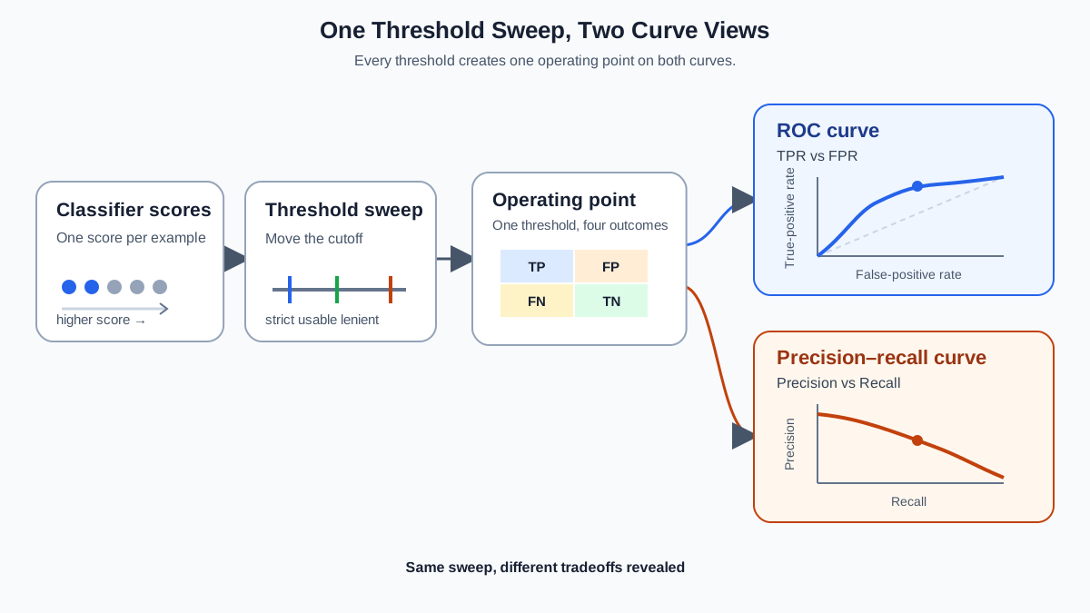
Before we dig into the plots, let's make one mechanism explicit.
A classifier doesn't output a final label directly. It outputs a score—a probability or confidence value—for each example. A decision threshold converts that score into an action: score above the threshold means "positive," below means "negative."
Each threshold creates one confusion matrix, and each confusion matrix becomes one point on each curve. Sweep the threshold from strict to lenient, and you trace out the full curve.
That threshold-specific point is your operating point: the precision, recall, false positive rate, and true positive rate you actually get when you deploy the model with a chosen threshold. Keep this in mind, because it's the difference between "this model ranks well" and "this model makes good decisions."
Knowledge check
Check your understanding
Answer this question before you continue.
What Each Curve Actually Plots
Both curves sweep across every possible decision threshold, computing two metrics at each one. That shared mechanics is where the similarity ends.
The ROC curve plots the true positive rate (recall) on the y-axis against the false positive rate on the x-axis. The false positive rate is the fraction of all negatives that the model incorrectly flags. Because it's normalized by the total number of negatives, the ROC curve summarizes ranking ability: how well the model puts positives above negatives.
The precision–recall curve plots precision on the y-axis against recall on the x-axis. Precision is the fraction of positive predictions that are actually correct. Recall is the fraction of true positives the model catches. The PR curve focuses entirely on the positive class and the quality of positive predictions.
The key contrast: ROC normalizes by the size of both classes. PR ignores the negative class's size except through the false positives that drag precision down.
The anchors differ too. A perfect model on ROC hugs the top-left corner at (0,1)—no false positives, all positives caught. A perfect model on PR hugs the top-right corner at (1,1)—perfect precision at full recall. A random model on ROC is the diagonal line with AUC 0.5. A random model on PR is a horizontal line at the positive-class prevalence—if 2% of your data is positive, random guessing gives you about 2% precision no matter what.
That last point matters more than most people realize. The PR baseline moves with your class balance. The ROC baseline never does.
Knowledge check
Check your understanding
Answer this question before you continue.
Why Class Imbalance Changes the Story
The ROC curve's weakness on imbalanced data comes from a simple mechanism: the false positive rate is a fraction of all negatives, and when negatives vastly outnumber positives, even a large number of false positives looks tiny.
Let me make this concrete. Suppose you have 500 true positives and 100,000 negatives. Your model flags 1,600 false positives. The false positive rate is 1.6%—on a ROC plot, that looks excellent. But precision tells a different story: those 1,600 false alarms swamp your 500 real hits. Precision is about 24%. If you're acting on every positive prediction, three out of four actions are wrong.
The same model, same test set, same threshold: ROC says "strong," PR says "weak." Neither plot is wrong. They're answering different questions, and on imbalanced data, the ROC curve's question—"how well does this model rank?"—is often not the question that matters operationally.
The PR curve exposes the problem because precision divides true positives by all positive predictions. The flood of false positives is right there in the denominator. You can't hide it.
One clarification before you overgeneralize: ROC is comparatively stable as a ranking view when prevalence changes, assuming the model's score behavior stays fixed. But that stability is about ranking, not operations. The same false positive rate that looked harmless in your 1% positive test set can produce a staggering number of false alarms when the negative class dominates your real-world data. ROC AUC being portable across prevalence does not make it a portable measure of decision quality.
Knowledge check
Check your understanding
Answer this question before you continue.
Reading the Curves: What the Shape Tells You
AUC numbers compress the whole curve into one value, which makes them convenient for model comparison—and terrible for understanding what your model actually does well.
ROC shape. A curve that rises steeply toward the top-left and then flattens means the model ranks most positives above most negatives early. A curve hugging the diagonal means near-random ranking. The shape tells you how cleanly the model separates classes.
PR shape. A curve that stays high in precision across most recall levels means positive predictions remain trustworthy even as you catch more of them. A sharp drop early means precision collapses the moment you try to catch more positives—the model's positive predictions are only reliable when it's being very selective.
Here's where single-number thinking fails you. Two models can have identical AUC on either curve but completely different shapes. One model might excel in the high-recall region—catching most positives, accepting lower precision. Another might shine at high precision—few false alarms, but missing many positives. The AUC average hides which region each model handles well.
The region that matters depends on your operating point. If you're screening for a disease and can afford follow-up tests, you want the model that stays strong at high recall. If you're sending automated alerts that interrupt people, you want the model that stays strong at high precision. The curve shows you the tradeoff. The AUC number hides it.
Choosing the Plot That Matches Your Deployment Cost
Here's the decision framework I use. It starts with one question before any talk of curves: what action will you take on a positive prediction, and what does each type of mistake cost?
Name the positive class. State what happens when you act on a false positive. State what happens when you miss a true positive. Those costs—not class balance alone—define which region of the curve you care about.
When ROC is the better view: You're comparing model families early in the process and care about ranking ability independent of any operating point. ROC AUC gives you a clean model-selection signal that is comparatively stable across prevalence. It's also a fair view when your classes are reasonably balanced and both error types carry similar weight.
When precision–recall is the better view: Your positive predictions trigger an action with real cost—an alert, an investigation, a follow-up. Precision directly reflects how many of your positive predictions are worth acting on. When the positive class is rare, or when the burden of false alarms is the constraint you can't exceed, PR exposes the tradeoff that matters.
But here's the sharper rule: don't pick one plot and ignore the other. Pick the operating region, then read both curves there.
Say you're building a model that flags suspicious transactions for manual review. Your team can investigate at most 2% of all transactions, and you need to catch at least 70% of fraud. That's your constraint: maximum alert burden, minimum recall.
Now compare two models. Model A has ROC AUC 0.93; Model B has ROC AUC 0.90. By the headline number, A wins. But when you read the PR curves at 70% recall, Model A delivers only 12% precision while Model B delivers 30%. At your operating point, Model B sends your team to investigate roughly 2.5 times fewer false alarms for the same fraud catch rate. Model A ranks better overall; Model B makes better decisions where you're forced to operate.
That's the workflow: state your minimum recall or maximum false-alarm burden, read the corresponding precision or false positive rate from each model's curve, and choose based on the deployment constraint. The curve that looks worse overall can win at the region that matters.
When neither curve is enough: if you already have a fixed decision threshold, evaluate at that threshold. Report precision, recall, and the confusion matrix. A threshold-swept curve summarizes all possible operating points; if you've already chosen yours, you don't need the summary—you need the specific numbers.
One caveat on PR AUC: it's sensitive to class prevalence. Don't compare PR AUC across datasets with different positive-class rates. A PR AUC of 0.7 on a dataset with 1% positives is not comparable to 0.7 on a dataset with 20% positives. ROC AUC is more portable across prevalence for this reason.
| Dimension | ROC Curve | Precision–Recall Curve |
|---|---|---|
| Axes | TPR vs. FPR | Precision vs. Recall |
| What it measures | Ranking quality across all thresholds | Positive-prediction quality across recall levels |
| Random baseline | Diagonal, AUC = 0.5 | Horizontal line at positive-class prevalence |
| Sensitivity to class imbalance | Low (as a ranking view) | High |
| Best use case | Model comparison, balanced classes, ranking quality | Rare positives, costly positive predictions, alert systems |
| When to be careful | Rare positive class with precision concerns | Comparing across datasets with different prevalence |
Knowledge check
Check your understanding
Answer this question before you continue.
Common Mistakes When Comparing Curves
Mistake 1: Quoting ROC AUC alone on an imbalanced problem. The number hides precision collapse. Always pair ROC AUC with a precision check when your positive class is rare.
Mistake 2: Comparing PR AUC across datasets with different prevalence. You're measuring different baselines. The difference you see may be class balance, not model quality.
Mistake 3: Assuming high ROC AUC means any threshold works. AUC says nothing about where the good operating region sits. A model with 0.95 AUC can still have a narrow band of usable thresholds.
Mistake 4: Ignoring that both curves are threshold-swept summaries. If you have a fixed decision rule, evaluate at that rule. Don't rely on a curve that averages across all thresholds you'll never use.
Mistake 5: Treating the curves as interchangeable. They answer different questions. Read both, find the disagreement, and let that disagreement tell you where your model's real weakness sits.
The Practical Takeaway
Name your positive class. State the cost of a missed positive versus a false alarm. Identify the operating region your deployment can tolerate—the minimum recall you need, or the maximum alert burden you can absorb. Then read both curves in that region and choose the model that performs best where you're forced to operate.
Run both curves on your own model. scikit-learn's RocCurveDisplay and PrecisionRecallDisplay make this trivial. Plot them side by side and look for disagreement: if ROC looks strong but PR looks weak, you have an imbalanced-data ranking model that doesn't produce trustworthy positive predictions. That disagreement isn't a bug in the metrics—it's the most useful diagnostic you'll get.
Knowledge check
Final check
Finish the article by checking the ideas you just learned.
References
Research updated Sep 8, 2026


