
Fit and Diagnose a Poisson Regression Model for Count Data
A count target is not a permission slip. It is a hypothesis about how the mean and variance move together — and you can test it.

Key topics
A count target is not a permission slip. It is a hypothesis about how the mean and variance move together — and you can test it.
You have a column of non-negative integers: support tickets per day, defects per batch, calls per hour. You have heard that Poisson regression is the tool for counts, so you reach for PoissonRegressor, fit it, and read the coefficients. That workflow can produce a confident-looking table of numbers that means almost nothing, because the model's central assumption — that the variance of the outcome equals its mean — was never checked.
The good news is that the check is cheap. By the end of this tutorial you will have a fitted model, a residual plot you can actually read, and a single dispersion number that tells you whether to trust the coefficients or switch tools. We will fit first, diagnose second, and interpret last.
What Poisson Regression Actually Assumes
We covered the log link and the Poisson likelihood in the earlier derivation, so I will not re-derive them here. What matters now is what those choices commit you to.
The model says the log of the expected count is linear in your features:
log(E[y | x]) = b0 + b1*x1 + b2*x2 + ...
Exponentiate both sides and you get E[y | x] = exp(linear predictor). Two consequences fall out immediately. Predictions are always positive, which is why the log link suits counts. And coefficients act multiplicatively on the rate, not additively on the count.
Three assumptions decide whether this model is appropriate:
- The outcome is a count of events in a fixed exposure window. A day, an hour, a batch, a region. If rows cover different window sizes, you are comparing unlike things.
- Equidispersion: variance equals the mean. This is the assumption beginners skip, and the one that breaks most often in practice.
- Events are independent, and the rate is constant within the modeled conditions. Clustering, time dependence, or unmodeled heterogeneity violates this.
Here is the trap. A count target satisfies assumption one and tells you nothing about assumptions two and three. Real count data frequently arrives overdispersed — variance larger than the mean — because of clustering or hidden group structure. When that happens, the model still runs. It just quietly reports standard errors that are too small and significance claims you should not believe.
Knowledge check
Check your understanding
Answer this question before you continue.
Set Up the Data and Fit the Model
You need Python with scikit-learn, NumPy, and pandas. No credentials, no external services.
I will build a small synthetic dataset so you can see the mechanism without fighting a real data pipeline. One predictor, a known rate relationship, and a count target.
import numpy as np
import pandas as pd
from sklearn.linear_model import PoissonRegressor

rng = np.random.default_rng(0)

n = 400
x = rng.normal(0, 1, n)
# True rate: exp(1.0 + 0.5 * x). Draw counts from that rate.
rate = np.exp(1.0 + 0.5 * x)
y = rng.poisson(rate)

df = pd.DataFrame({"x": x, "y": y})
print(df.head())
print("mean:", df["y"].mean(), "var:", df["y"].var())
The mean and variance of y should land near each other here, because we generated the data from a Poisson process. That is the point of starting synthetic: you know the ground truth before you fit.
Now fit the model:
model = PoissonRegressor(alpha=0.0, max_iter=1000)
model.fit(df[["x"]], df["y"])

print("intercept:", model.intercept_)
print("coef:", model.coef_)
A few things to notice. PoissonRegressor uses the log link by default, so the coefficients live on the log-rate scale. The alpha parameter is L2 regularization and it is a real knob, not a formality — the default is not zero, so if you want the plain maximum-likelihood fit for a clean comparison, set it explicitly. I set alpha=0.0 here to recover the true coefficients.
To read the coefficient on the rate scale, exponentiate it:
print("rate multiplier per unit x:", np.exp(model.coef_))
A coefficient of 0.5 means roughly a 65% higher expected count per unit increase in x. That is the sentence you would write in a report. The raw 0.5 is a log-rate effect; the exponentiated value is the multiplicative effect on the expected count.
Sanity-check the predictions before anything else:
pred = model.predict(df[["x"]])
print("min pred:", pred.min(), "max pred:", pred.max())
Predictions should be positive and in a plausible range relative to your observed counts. If they are not, stop and fix the data, not the model.
Knowledge check
Check your understanding
Answer this question before you continue.
Inspect Predicted Rates Against Observed Counts
Here is where OLS intuition misleads you. In linear regression, a scatter of predicted versus observed should hug the diagonal. In count data, it will not — and that is expected. You are comparing a rate to a single draw from that rate. A rate of 3.0 can produce 1, 2, 5, or 7 on any given day.
The better view is to bin the predictions and compare group means:
df["pred"] = pred
df["bin"] = pd.qcut(df["pred"], q=5, duplicates="drop")

summary = df.groupby("bin", observed=True).agg(
    mean_pred=("pred", "mean"),
    mean_obs=("y", "mean"),
    n=("y", "size"),
)
print(summary)
If the model is well specified, mean_pred and mean_obs should track each other across bins. Systematic gaps in one region are a specification signal, not a tuning problem. Adding regularization or more iterations will not fix a missing predictor or a wrong functional form.
Watch the low-count region carefully. When the mean is very small, effects are hard to estimate and the model can look fine while being uninformative.
Warning: If rows cover different exposure windows — some days are 8 hours, some are 24 — a raw count model compares unlike things. You need to handle exposure, typically by including
log(exposure)as an offset term, before the coefficients mean anything.
Knowledge check
Check your understanding
Answer this question before you continue.
Residual Diagnostics for Count Models
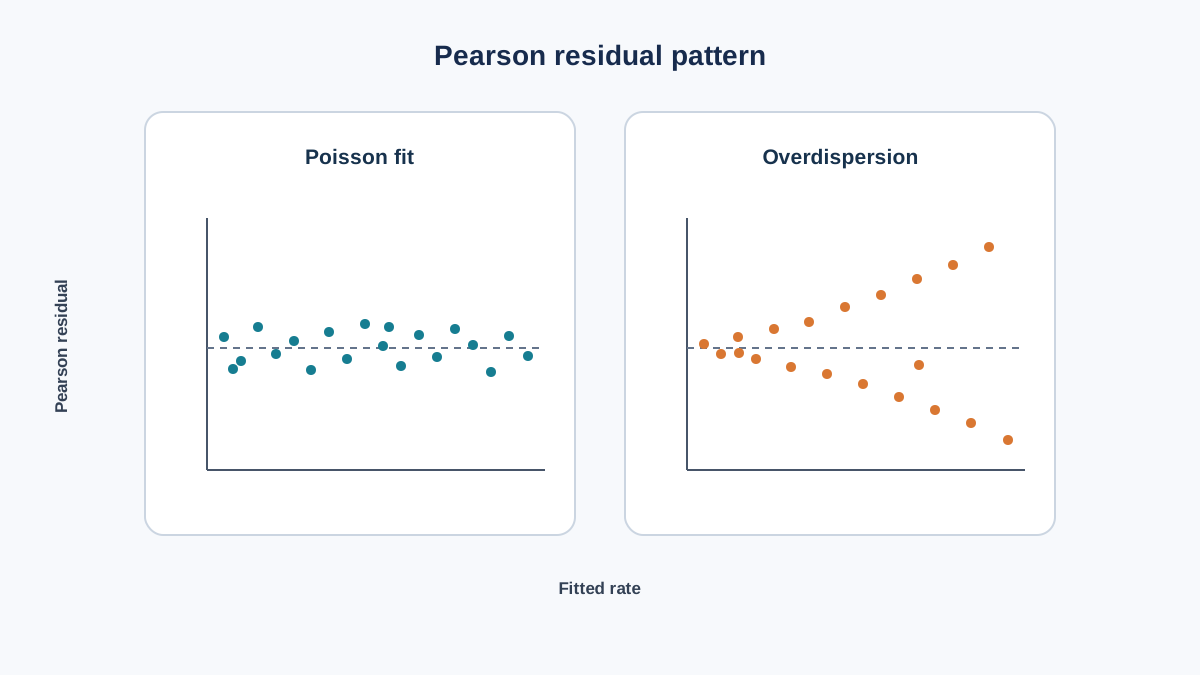
Raw residuals (y - pred) are the wrong diagnostic here. Their scale changes with the fitted value, so you cannot compare them across the range. Use deviance residuals or Pearson residuals instead, which normalize the scale.
# Pearson residuals: (y - mu) / sqrt(mu)
mu = pred
pearson_resid = (df["y"] - mu) / np.sqrt(mu)

import matplotlib.pyplot as plt
plt.scatter(mu, pearson_resid, alpha=0.4)
plt.axhline(0, color="red", linestyle="--")
plt.xlabel("fitted rate")
plt.ylabel("Pearson residual")
plt.show()
Now the part that trips people up. The raw residuals y - mu do fan out as the fitted rate grows — that is the Poisson variance increasing with the mean. But Pearson residuals divide that spread by sqrt(mu), which is exactly the standard deviation the Poisson model predicts. So for a correct model, the Pearson residuals should look like a roughly flat band of constant width centered on zero, not a fan.
That distinction matters because it changes what you are looking for:
- A fan shape in the Pearson residuals means the actual variance is growing faster than the mean — the signature of overdispersion. This is the opposite of the OLS instinct, where a fan in raw residuals signals trouble; here it signals that the Poisson variance assumption is too tight.
- Curvature in the residual cloud suggests a missing nonlinear term.
- Systematic bands or stripes suggest a missing categorical predictor.
- Structure against time or group order is evidence against independence. If you have an ordering column, plot residuals against it and look for drift or clustering.
Common mistake: Reading a fan in the raw residuals as heteroscedasticity and "fixing" it with a log transform on the target. The raw fan is what Poisson counts are supposed to do. The diagnostic that matters is whether the Pearson residuals stay flat.
Knowledge check
Check your understanding
Answer this question before you continue.
Check for Overdispersion Before You Trust Coefficients
This is the central decision gate. Compute the dispersion estimate:
# Pearson chi-square statistic divided by residual degrees of freedom
pearson_chi2 = np.sum(pearson_resid ** 2)
dof = len(df) - 2  # n minus number of estimated parameters
dispersion = pearson_chi2 / dof
print("dispersion estimate:", dispersion)
Values near 1 support the Poisson assumption. Values meaningfully above 1 indicate overdispersion.
Interpret the magnitude honestly. Mild overdispersion inflates standard errors slightly. Severe overdispersion — say, a dispersion estimate of 5 or 10 — can make every significance claim in your coefficient table meaningless. The point estimates may still be reasonable; the uncertainty around them is not.
As a first pass before fitting, check the simple variance-to-mean ratio of the raw outcome:
print("var/mean of y:", df["y"].var() / df["y"].mean())
If that ratio is far above 1, you already know the Poisson assumption is strained.
If overdispersion is present, your realistic options are:
| Option | When it fits |
|---|---|
| Negative binomial regression | Variance grows faster than the mean; the standard fix |
| Quasi-Poisson style SE correction | You want Poisson coefficients but honest standard errors |
| Add the missing predictor or group variable | The overdispersion comes from unmodeled structure |
| A different model family entirely | The data-generating process is not count-like at all |
Be explicit about what a dispersion estimate is: evidence about fit, not proof of the data-generating process. It tells you whether the Poisson variance assumption is plausible, not whether the world is truly Poisson.
One Experiment: Break the Model on Purpose
The fastest way to internalize equidispersion is to violate it deliberately. Take the working dataset and inject extra variance by mixing two rate regimes, while keeping the target a count.
# Inject a hidden group effect: half the rows get a higher rate
group = rng.integers(0, 2, n)
rate2 = np.exp(1.0 + 0.5 * x + 0.8 * group)
y2 = rng.poisson(rate2)

df2 = pd.DataFrame({"x": x, "group": group, "y": y2})

model2 = PoissonRegressor(alpha=0.0, max_iter=1000)
model2.fit(df2[["x"]], df2["y"])

mu2 = model2.predict(df2[["x"]])
pearson2 = (df2["y"] - mu2) / np.sqrt(mu2)
disp2 = np.sum(pearson2 ** 2) / (len(df2) - 2)

print("coef after injection:", model2.coef_)
print("dispersion after injection:", disp2)
Expected result: the coefficient shifts, and the dispersion estimate climbs well above 1 — even though nothing about the target changed. It is still a count. It is still non-negative integers.
The lesson is precise: the model did not fail because the target stopped being a count. It failed because the mean-variance relationship changed. That is the assumption that matters.
Now run the fix. The group variable is still in df2, so you can refit with it included and watch the dispersion come back down:
model3 = PoissonRegressor(alpha=0.0, max_iter=1000)
model3.fit(df2[["x", "group"]], df2["y"])

mu3 = model3.predict(df2[["x", "group"]])
pearson3 = (df2["y"] - mu3) / np.sqrt(mu3)
disp3 = np.sum(pearson3 ** 2) / (len(df2) - 2)

print("coef with group:", model3.coef_)
print("dispersion with group:", disp3)
The dispersion estimate should drop back toward 1, because the extra variance was unmodeled structure, not a genuine violation of the Poisson family. That comparison is the whole point of the experiment: it separates two causes of overdispersion that look identical in the diagnostic number.
What the comparison can and cannot establish:
- It can show that a specific omitted feature accounts for the excess variance, which means the fix is a better-specified feature set rather than a new model family.
- It cannot prove the data is truly Poisson. It only shows that, conditional on the features you included, the mean-variance relationship is consistent with the Poisson assumption.
If adding the group variable leaves dispersion well above 1, the overdispersion is not explained by that feature. At that point the variance genuinely exceeds the mean and you need a different family, most commonly negative binomial.
When Poisson Regression Is the Right Tool
Use it when three things hold: the outcome is a count in a fixed exposure window, events are plausibly independent, and the variance tracks the mean.
Do not use it when counts are clustered, strongly time-dependent, or visibly overdispersed. A count target is necessary but not sufficient.
Here is the rule I would apply to any new count dataset before writing a single line of modeling code:
- Compute the variance-to-mean ratio of the raw target.
- Fit the Poisson model and compute the dispersion estimate.
- Plot Pearson residuals against fitted values and against any ordering variable.
- Only then read the coefficients.
A coefficient table without a fit check is an unfinished analysis. Report the dispersion estimate alongside the coefficients, and say plainly whether the Poisson assumption held.
If dispersion is near 1 and Pearson residuals show no structure, interpret the exponentiated coefficients on the rate scale and move on. If not, the honest next move is negative binomial regression, a corrected variance estimate, or a better-specified feature set — not a transform applied to a model that was already behaving correctly.
Your next step: take one count column from your own data, run the variance-to-mean ratio, and let that single number decide whether Poisson regression deserves your time or whether you should reach for negative binomial first.
Knowledge check
Final check
Finish the article by checking the ideas you just learned.
References
Build stronger machine learning foundations
Use structured resources to connect theory, scikit-learn workflows, and evaluation practice.


