
Run a PCA Experiment in Scikit-Learn: Scaling, Components, and Information
You fit PCA, print the explained variance ratio, and see that PC1 captures 92% of the variance. That looks like a strong result. It might be an artifact of…

Key topics
You fit PCA, print the explained variance ratio, and see that PC1 captures 92% of the variance. That looks like a strong result. It might be an artifact of one unscaled column.
Explained variance describes geometry, not usefulness. It tells you how much spread your components preserve. It says nothing about whether the representation helps you predict anything. This tutorial makes that gap visible by running the same pipeline three ways and comparing what actually changes.
What You Need Before You Fit Anything
You should already be comfortable with two ideas: PCA finds orthogonal directions of maximum variance, and a scikit-learn pipeline bundles fit-time and transform-time behavior so preprocessing stays consistent between training and evaluation. If either feels shaky, the concept article on PCA and the pipeline explainer cover them. Here we use both as tools.
You need Python with scikit-learn, NumPy, and pandas. No credentials, no external services. We will use the breast cancer dataset bundled with scikit-learn because its features sit on genuinely different scales — some measure area in the hundreds, others measure smoothness in the hundredths. That mixed scale is the whole point.
By the end, you should be able to produce a transformed array, read its explained variance, and explain in one sentence why scaling changed the result.
The Scaling Trap: Why PCA Centers but Does Not Scale
Scikit-learn's PCA centers your data — it subtracts the mean of each feature — but it does not divide by the standard deviation. This is documented behavior, not a bug. PCA operates on the covariance structure of your data, and covariance depends on units.
A feature measured in the thousands will produce variance in the millions. A feature measured in the tenths will produce variance in the hundredths. PCA does not know which one carries signal. It only sees which one carries spread. So the large-unit feature dominates the first component whether or not it deserves to.
Common mistake: Fitting PCA on raw features and reading the first component's loadings as if they reflect importance. They reflect scale.
The decision rule is simple. Standardize when features have different units or scales. Skip scaling only when every feature is already on a comparable, meaningful scale and you want to preserve relative magnitude. And note the boundary: if absolute magnitude is the signal — say, total spend versus average spend — standardizing can destroy the information you need.
Knowledge check
Check your understanding
Answer this question before you continue.
Build the Pipeline: Scaling and PCA in One Leakage-Aware Object
Here is the smallest correct implementation. The pipeline bundles StandardScaler and PCA so that both are fit on training data only.
import numpy as np
from sklearn.datasets import load_breast_cancer
from sklearn.decomposition import PCA
from sklearn.model_selection import train_test_split
from sklearn.pipeline import Pipeline
from sklearn.preprocessing import StandardScaler

X, y = load_breast_cancer(return_X_y=True)
X_train, X_test, y_train, y_test = train_test_split(
    X, y, test_size=0.2, random_state=42, stratify=y
)

pipe = Pipeline([
    ("scaler", StandardScaler()),
    ("pca", PCA(n_components=5)),
])

X_train_pca = pipe.fit_transform(X_train)
X_test_pca = pipe.transform(X_test)

print("Train shape:", X_train_pca.shape)
print("Test shape: ", X_test_pca.shape)
Expected output:
Train shape: (455, 5)
Test shape:  (114, 5)
The pipeline is not just tidier than manual steps. It is the difference between a representation that generalizes and one that quietly cheats. If you fit the scaler or PCA on the full dataset, test-set statistics leak into the components. The mean and standard deviation of your test rows shape the directions your training rows get projected onto. Your evaluation then reports how well the representation fits data it has already seen.
The manual equivalent makes the pipeline less of a black box:
scaler = StandardScaler().fit(X_train)
X_train_scaled = scaler.transform(X_train)
X_test_scaled = scaler.transform(X_test)

pca = PCA(n_components=5).fit(X_train_scaled)
X_train_pca = pca.transform(X_train_scaled)
X_test_pca = pca.transform(X_test_scaled)
Same result. The pipeline just guarantees you cannot accidentally call fit on the wrong split.
Debugging signal: If your transformed shape does not match
n_components, check whether you calledfit_transformon the wrong split or reused a fitted transformer on new data with a different feature count.
Knowledge check
Check your understanding
Answer this question before you continue.
Read the Output: Explained Variance and What It Does Not Tell You
Now inspect what the pipeline actually produced.
pca = pipe.named_steps["pca"]
print("Explained variance ratio:", pca.explained_variance_ratio_)
print("Cumulative:             ", np.cumsum(pca.explained_variance_ratio_))
explained_variance_ratio_ is the share of total variance captured by each component. The cumulative sum tells you how much variation a given component count retains. The variance estimate uses n_samples - 1 degrees of freedom, so the numbers shift slightly with dataset size.
Here is the misconception that costs people real modeling performance: high retained variance means the representation preserves spread, not that it preserves the label-relevant signal. A component can carry most of the variance and still be useless for prediction. The signal you need might live in a low-variance direction that PCA discards first.
The concrete check is a downstream comparison. Train the same classifier on the full feature set and on the PCA-reduced set. If accuracy drops while explained variance looks high, the discarded components held predictive information.
One more knob worth knowing: whiten=True scales each component to unit variance. This removes the relative variance information from the output — useful for models that assume isotropic inputs, but it costs you the ability to read component magnitudes as importance.
Knowledge check
Check your understanding
Answer this question before you continue.
Choose a Component Count: Three Approaches and Their Tradeoffs
| Approach | How | Tradeoff |
|---|---|---|
| Fixed count | n_components=2 or 3 | Good for visualization or hard input-size constraints; arbitrary otherwise |
| Variance threshold | n_components=0.95 | Fast, but the threshold is arbitrary and variance is not usefulness |
| Elbow inspection | Plot cumulative variance, look for the bend | A judgment call; the elbow is often less sharp than tutorials suggest |
Scikit-learn lets you pass a float to n_components and it will keep enough components to reach that cumulative ratio. That is convenient, but it inherits the same flaw: you are optimizing for retained spread, not for downstream performance.
The honest criterion is the one that costs the most work: choose the count that performs best under your actual evaluation. Use cross-validation on the downstream task. Variance alone will not tell you where the signal lives.
Tip: Fewer components mean faster training and less noise. They also mean a real risk of discarding the signal you needed. State that tradeoff explicitly rather than pretending one number is correct.
Knowledge check
Check your understanding
Answer this question before you continue.
Inspect the Transformed Representation
Look at the transformed array. Each column is a component score, not an original feature. Rows are still samples.
print(X_train_pca[:3])
To see how original features load onto each component, inspect components_:
loadings = pca.components_
print("PC1 loadings:", np.round(loadings[0], 3))
This is where you learn whether a component is a meaningful blend or a scaling artifact. If one feature dominates a component's loadings, either scaling was skipped or that feature genuinely dominates the variance. Check which before drawing conclusions.
If you have labels, plot the first two components colored by class as a sanity check on whether structure survives compression. Treat the plot as a hint, not proof.
The interpretability cost is real: components are linear combinations, so you lose the direct "this feature went up" reading that raw features give you. That matters when stakeholders need to understand why a prediction was made.
Run the Experiment: Change One Thing at a Time
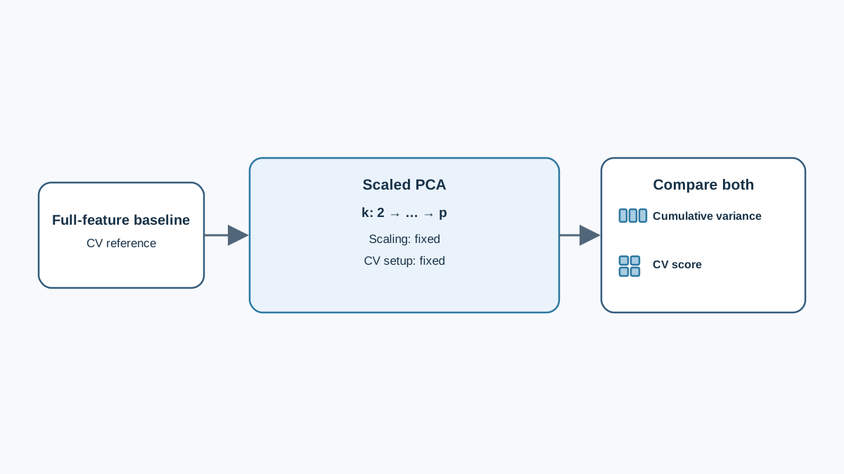
Three modifications turn this tutorial into an experiment with observable outcomes.
Experiment 1: Drop the scaler. Rerun the pipeline without StandardScaler and compare the first component's loadings and the explained variance ratio. Record what changed. You will likely see the first component's variance share jump — and its loadings concentrate on the largest-unit features.
Experiment 2: Sweep n_components. Try 2, 5, 10, and 20. For each, record cumulative variance and a downstream model score. Plot both against component count. Note where the curves diverge — that divergence is the gap between retained variation and predictive value.
Experiment 3: Leak on purpose. Fit the scaler on the full dataset instead of the training split, then compare the resulting test score. This is a direct demonstration of how leakage inflates your sense of how well the representation generalizes.
Record component count, cumulative variance, and downstream score side by side. If variance rises but score does not, you have evidence that the extra components are noise or that the signal lives in low-variance directions.
When PCA Helps and When It Costs You
PCA is a good fit when you have high-dimensional data with correlated features, when you need to visualize structure, when you want noise reduction before a model that assumes isotropic inputs, or when you want to speed up training on redundant features.
It is a poor fit when individual feature interpretability is required, when the signal lives in low-variance directions, when features are already few and uncorrelated, or when nonlinear structure is the point. PCA is linear — if your data lies on a curved manifold, linear compression will smear it, and a nonlinear method may serve you better.
My rule: run PCA as an experiment with a measured downstream comparison, not as a default preprocessing step. The variance number is a starting point, not a verdict.
Where to Go Next
Take this same experiment pattern to a dataset you actually care about. Fit the pipeline, read the explained variance, then compare the reduced representation against the full feature set under cross-validation. If the reduced version wins or ties, you have earned the compression. If it loses, you have learned where your signal lives — and that is worth more than a clean-looking variance ratio.
Knowledge check
Final check
Finish the article by checking the ideas you just learned.
References
Build stronger machine learning foundations
Use structured resources to connect theory, scikit-learn workflows, and evaluation practice.


