
Learning Curves in Machine Learning: Diagnose Data or Model Complexity
If you are like most beginners, you start guessing. Maybe more data will fix it. Maybe a bigger model. Maybe fancier features. You try one, see little…

Key topics
You trained a model. The validation score is disappointing. Now what?
If you are like most beginners, you start guessing. Maybe more data will fix it. Maybe a bigger model. Maybe fancier features. You try one, see little change, try another, and slowly burn through evenings without learning anything systematic about the problem.
The learning curve exists to end that guessing. It is a diagnostic that shows you why the model underperforms, so your next experiment is a decision rather than a hope.
Why a Single Score Leaves You Guessing
A validation score is a snapshot. It tells you how well the model performed on one test, but it cannot tell you why it missed. A low score could mean any of the following:
- The model is too simple to capture the pattern (underfitting).
- The model is flexible enough but is memorizing noise instead of learning structure (overfitting).
- The model is fine, but there is not enough data for it to learn the pattern well.
Those three failures demand three different fixes. More data helps one of them. A more complex model helps another. Better features might help all of them, or none.
The learning curve separates these cases by asking a question a single score cannot answer: how does this model behave as it sees more training data?
If you have already met overfitting, underfitting, and the bias–variance tradeoff, this is where those ideas become operational. The learning curve is the tool that shows you which failure mode you are actually in.
What a Learning Curve Actually Shows
A learning curve plots model performance against the amount of training data used. Two lines matter:
- Training score: how well the model performs on the data it learned from.
- Validation score: how well the model performs on data it has never seen.
The x-axis is the number of training samples. The y-axis is the score—accuracy, F1, R², or whatever metric fits your problem.
The typical shape follows a consistent logic. With very few training samples, a model can often fit that small set almost perfectly, so the training score starts high. But the validation score starts low because the model has not seen enough examples to learn the real pattern. As training data grows, the training score usually falls—the model can no longer memorize everything—while the validation score rises as the model learns genuine structure.
The diagnostic signal is not either line on its own. It is the gap between them, plus the level where they converge.
A wide gap means the model performs much better on training data than on new data. That is the signature of high variance: the model is flexible enough to memorize, but it is not generalizing. A narrow gap with both lines low means the model is too simple to capture the pattern at all. That is high bias.
The second thing to watch is the plateau. When the validation curve flattens across a broad range of training sizes, the current model-and-features combination has stopped improving. That is evidence that adding data will not help this setup—but it is not proof that data was never the issue. A plateau can also mean the model lacks the capacity to use more data, or the features do not carry the signal the model would need to improve. The plateau is a clue about the tested configuration, not a verdict on the data itself.
Note: There are two kinds of curves called learning curves. The epoch-wise curve plots performance against training iterations and is common in deep learning. The sample-wise curve plots performance against training-set size. This article focuses on the sample-wise version, which is the one that tells you whether more data will help.
Knowledge check
Check your understanding
Answer this question before you continue.
Reading the Three Classic Patterns
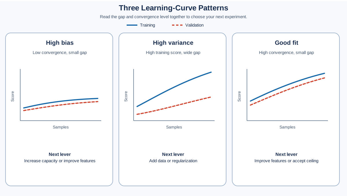
Most learning curves fall into one of three recognizable shapes.
High Bias: Both Curves Converge Low
The training score and validation score both plateau at a low level, with a small gap between them. The model has stopped improving, and it was never very good even on the data it trained on.
This is underfitting. The model lacks the capacity to represent the pattern, or the features do not carry enough signal. More data will not fix it, because the model is not using the data it already has. The lever is model capacity: a more complex model, better features, or less regularization.
Knowledge check
Check your understanding
Answer this question before you continue.
High Variance: A Wide Gap That Will Not Close
The training score stays high while the validation score lags behind, and the gap between them remains wide even as data grows. The model can memorize the training set but cannot generalize.
This is overfitting. The lever is to constrain the model or give it more evidence: add regularization, simplify the model, or collect more data. If the validation curve is still climbing, more data is a legitimate fix. If it has plateaued, the model itself needs to change.
Good Fit: Converged Near the Top
Both curves rise toward a high score and converge with a small gap. The model is near its practical ceiling for this feature set and data. Further gains will be incremental.
The honest conclusion here is uncomfortable but useful: the remaining error may be noise, or the signal you need may not exist in your current features. No amount of model tuning will cross that ceiling. If the ceiling is unacceptable, the next experiment is feature engineering—not more data and not more model complexity.
The gap tells you whether the model generalizes. The convergence level tells you how well it can possibly do with the representation you gave it. Read both together.
When the Pattern Is Ambiguous
Learning curves are evidence, not fingerprints. Sometimes the classic shapes do not appear cleanly, and the worst thing you can do is force a diagnosis anyway.
Three situations deserve extra caution:
- Jagged or noisy curves. A single dip or spike is not a signal. The noise often comes from small training sizes where one split can dominate the average.
- Curves that cross. If the validation curve overtakes the training curve, something is off—likely a data leak, a bug in the split, or an evaluation mismatch. Do not interpret this as a healthy pattern.
- A validation curve still rising slowly. If the curve has not clearly flattened, you cannot conclude that more data will fail. The honest answer is that the tested range was too narrow to know.
When the pattern is ambiguous, check the spread before you name the cause. The mean curve can hide large variation across folds, especially at small training sizes. If the curves look jagged, increase the number of CV folds or repeat the process and average the results. You are looking for the trend, not the texture.
Treat each pattern as a hypothesis, then run one controlled experiment to test it. Change the model, or change the features, or add data—but change one thing at a time and see whether the curve moves the way your diagnosis predicted.
Knowledge check
Check your understanding
Answer this question before you continue.
When More Data Is Not the Answer
The most common beginner instinct is to treat a bad score as a data problem. The learning curve frequently proves otherwise.
If both curves have plateaued low and close together, the model is underfitting. It has already absorbed everything useful from the data, and the bottleneck is model capacity or feature quality. Doubling the dataset would just give the model more examples of a pattern it cannot learn.
If the validation curve has flattened across a broad range of training sizes, the same logic applies. A plateau is a signal that acquiring new data will not improve generalization for the current model and features. The model has reached the limit of what this data and this representation can teach it.
The decision rule I use:
- Collect more data when the validation curve is still climbing and the gap with the training curve is wide.
- If the validation curve has clearly flattened, change the model or the features instead.
- If the curve is noisy or still rising slowly, run one controlled experiment before committing to a diagnosis.
That single rule would save beginners more wasted effort than any other piece of diagnostic advice I know.
Knowledge check
Check your understanding
Answer this question before you continue.
Plotting Learning Curves with scikit-learn
You do not need to build learning curves by hand. scikit-learn provides the learning_curve utility in sklearn.model_selection, which handles the mechanics for you.
The essential parameters are the estimator, the training sizes to test, and cross-validation. Cross-validation matters here: at each training size, the model is trained and scored multiple times on different splits, and the results are averaged. That smooths the curve and prevents one unlucky split from misleading you.
from sklearn.model_selection import learning_curve
import numpy as np

train_sizes, train_scores, val_scores = learning_curve(
    estimator, X, y,
    cv=5,
    train_sizes=np.linspace(0.1, 1.0, 10),
    scoring="accuracy"
)

train_mean = train_scores.mean(axis=1)
val_mean = val_scores.mean(axis=1)
Plot train_mean and val_mean against train_sizes, and you have your diagnostic. But do not plot only the means. The train_scores and val_scores arrays also carry the spread across folds, and that spread tells you whether to trust the trend. Plot the standard deviation as a shaded band, or at least glance at the fold-level values before you commit to a diagnosis.
Common Mistakes When Reading Learning Curves
Learning curves are simple to plot and surprisingly easy to misread. These are the mistakes I see most often.
Reading only the validation curve. The validation curve alone cannot distinguish underfitting from overfitting. A low, flat validation curve looks identical in both cases. The training curve is what tells you which one you are looking at. Ignore the gap, and you lose the diagnosis.
Concluding "more data" from a low score. A low validation score is a symptom, not a cause. Check whether the validation curve is still rising before you spend time and money collecting data. If it has clearly plateaued, data was never the bottleneck for this model and feature set.
Confusing the two kinds of curves. The epoch-wise training curve—loss plotted against training iterations—shows whether optimization is working. The sample-wise learning curve shows whether the model needs more data or more capacity. They answer different questions, and mixing them up produces confident nonsense.
Trusting a noisy curve from a single split. One train/validation split can produce a misleading curve, especially with small data. Cross-validation at each training size gives you a stable estimate. The extra compute is worth the clarity.
Treating a plateau as a universal verdict. A flat validation curve says the current model-plus-features combination stopped improving over the tested range. It does not say the data is exhausted forever. A better model or better features can make additional data useful again. Read the plateau as a statement about the setup you tested, not about the universe of possible models.
Expecting smooth, well-behaved curves. Real learning curves are often irregular. A single dip or spike is not a signal. Look at the overall trend and the shape of the gap, not individual points.
From Diagnosis to Your Next Experiment
Once you can read the pattern, the next experiment chooses itself.
| Pattern you see | Likely cause | Next experiment |
|---|---|---|
| Both curves low, small gap | High bias | Increase model capacity, add features, reduce regularization |
| Wide gap, training high, validation low | High variance | Add data, add regularization, simplify the model |
| Both curves high, small gap | Good fit | Accept the ceiling or improve features; tuning will not help |
| Validation still climbing, wide gap | Data bottleneck | Collect more data |
| Noisy, crossing, or unclear curves | Measurement problem | Inspect fold spread, fix the split, or extend the training-size range |
The learning curve does not tell you the perfect model. It tells you which lever to pull next—and just as importantly, which lever not to pull. That is enough to turn model building from random experimentation into a directed search.
Here is the practical takeaway: when your model underperforms, plot the learning curve first. Read the gap. Read the plateau. Check the spread. Let the shape choose your next experiment—more data when the validation curve is still climbing, more capacity or features when both curves sit low together, and a closer look at your measurement when the pattern is unclear.
Next time you have a model with a disappointing score, do not ask what to try. Plot the curve, name the pattern you see, and let the diagnosis tell you what the model actually needs.
Knowledge check
Final check
Finish the article by checking the ideas you just learned.
References
Research updated Sep 8, 2026


